Selected Disaster Overview Page
The Selected Disaster Overview page shows all information about the selected disaster.
Currently, there are three widgets on the main overview and two separate tabs.
You can also use the available action items in the header. See the documentation for the Header Action Items here.
Widget “Time”
This widget shows the current time.
Widget “Timer”
This widget shows the passed time since the disaster was created in the KatApp system.
Widget “Map”
This widget shows a map at the position of the disaster and markers for the most recent triages of each patient.
If several triages are very close to each other they are clustered and a cluster icon with the number of clustered triages is shown instead:

You can view the individual triages by clicking on the cluster icon:
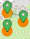
Each triage marker consists of an icon indicating the location and a color indicating the triage classification. The icons for the different locations are explained in the map caption.
The caption will be hidden if the browser window isn’t wide enough. In this case, the following icon will be displayed on the bottom right of the map instead:
![]()
![]()
You can open the caption by clicking on it.
By clicking on a triage marker you can display additional information about the triage/patient.
Tab “Patients”
This tab contains a table with information about each patient and their triage trend. If a patient was last triaged less than 15 minutes ago, an exclamation mark will be shown in the first column.
Selected columns can be filtered, either by selecting from predefined options in a dropdown or by entering a search text.
Tab “Triages”
This tab contains information about the total number of patients and how many have already been released. It also provides an overview on the number of triages per location and their classification.