Header Action Items
The header of the KatApp Dashboard provides several action items. You can use these to perform various actions.
Depending on the page you’re on, there will be different action items available. Following, all actions items are listed, so you know what they mean if you see them.
Link to User Documentation
By clicking this icon you can open the user documentation of the KatApp Dashboard in a new tab.
Dark Mode Toggle
By clicking this icon you can switch between light and dark mode.
Language Selection
By clicking this icon you can switch between the available languages. Currently, the KatApp Dashboard supports German and English.
Logout
By clicking this icon you can log out of the KatApp Dashboard. If the logout was successful, you’ll be forwarded to the Login page and a success message will be shown at the bottom left of the page.
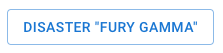
Selected Disaster Exit
After clicking this button a dialog will open where you’ll have to confirm that you want to exit the selected disaster. After confirmation, you’ll be forwarded to the Home page and can select a different disaster.
Online Indicator
This icon indicates whether the KatApp Dashboard is connected to the KatApp Backend and receives live information about changes to disasters, patients or triages.
It will be shown once you’ve selected a disaster.
If the connection fails, the following icon will be shown instead:
In case of a failed connection you have several options:
- Exit the selected disaster and re-select it on the Home page
- Reload the page, log in again and select the relevant disaster on the Home page
- Log out, log in again and select the relevant disaster on the Home page